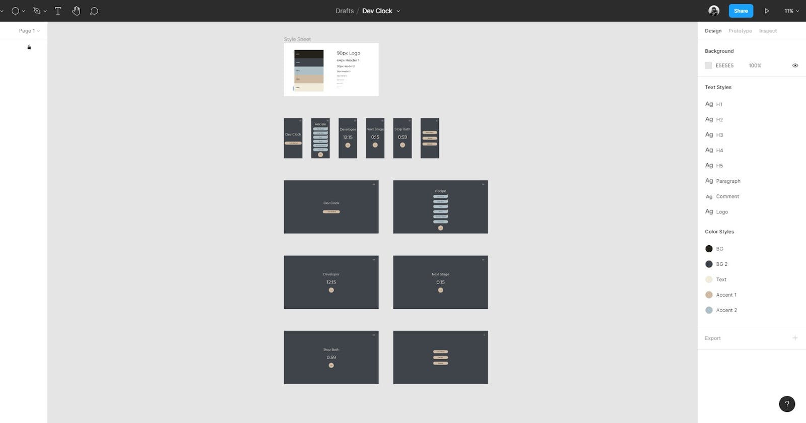


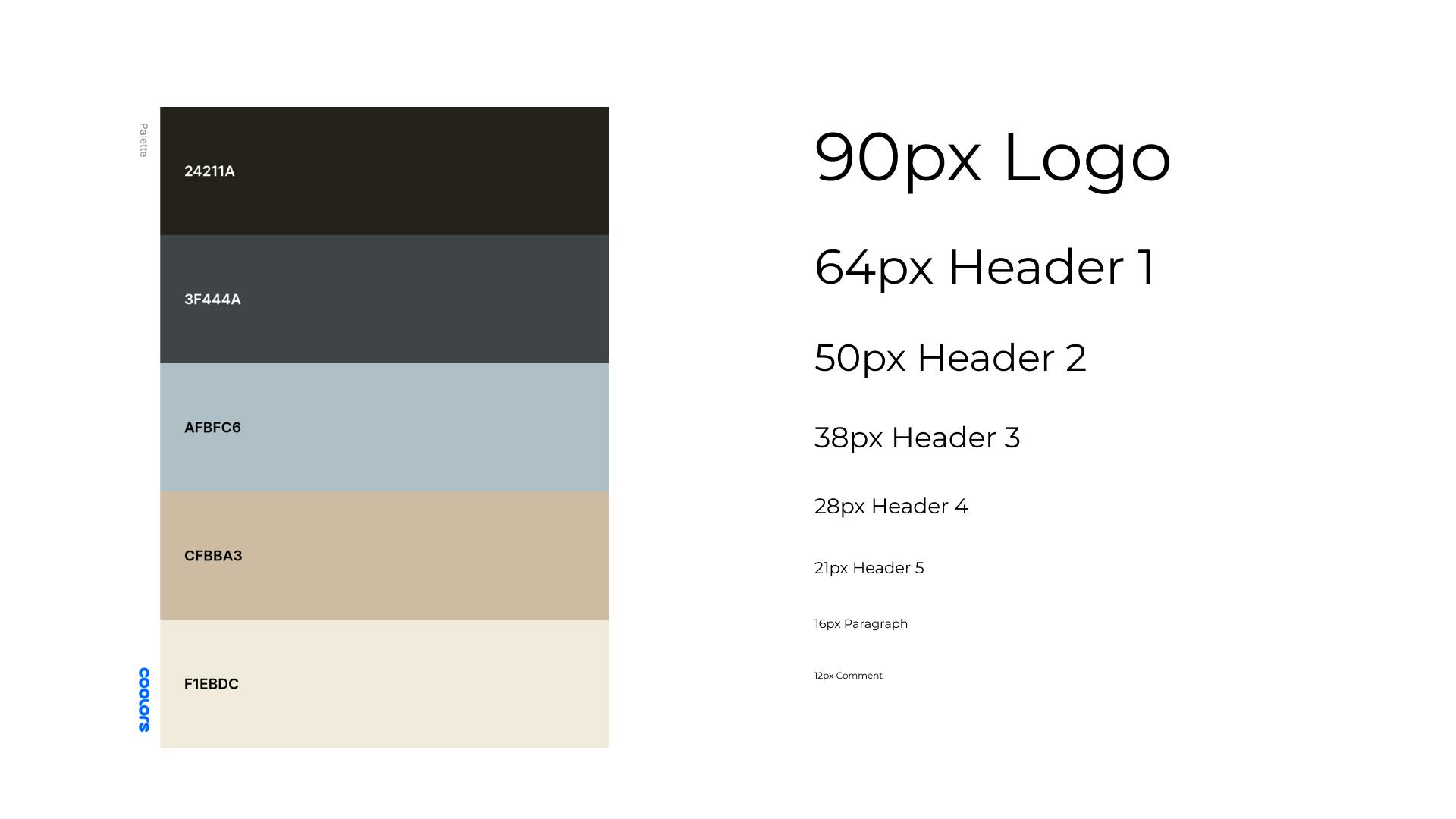
Style Sheet 💅
With the wire-framing completed, I moved onto designing what the web app would look like. The very first thing I do when designing a project is creating a style sheet. This is super helpful to keep styles consistent across the whole document, and makes it faster for applying styles to new elements. I usually find a good color scheme I want to work with, and then I find the type faces and the type scale I want to use. Then in Figma I put it all on one sheet and use their tools to create styles for colors and fonts. That way I can quickly access my H1 or background colors. This also makes it incredibly helpful for when you have to code, because now you have every font size and color you need to import into your assets. For this design I'll be using Montserrat and a palette from Coolors.co
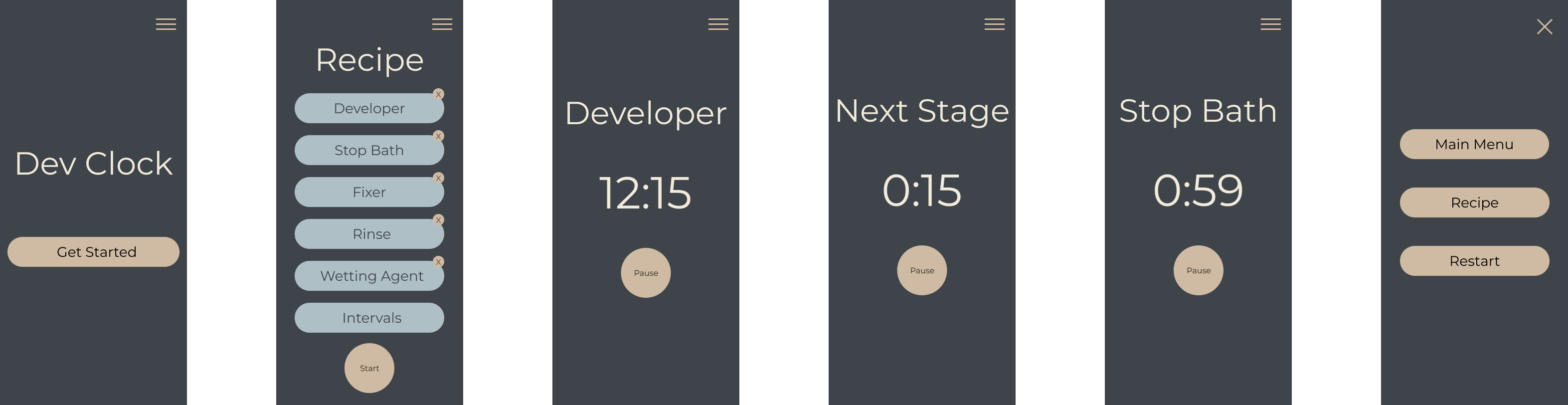
Mobile Design 📱
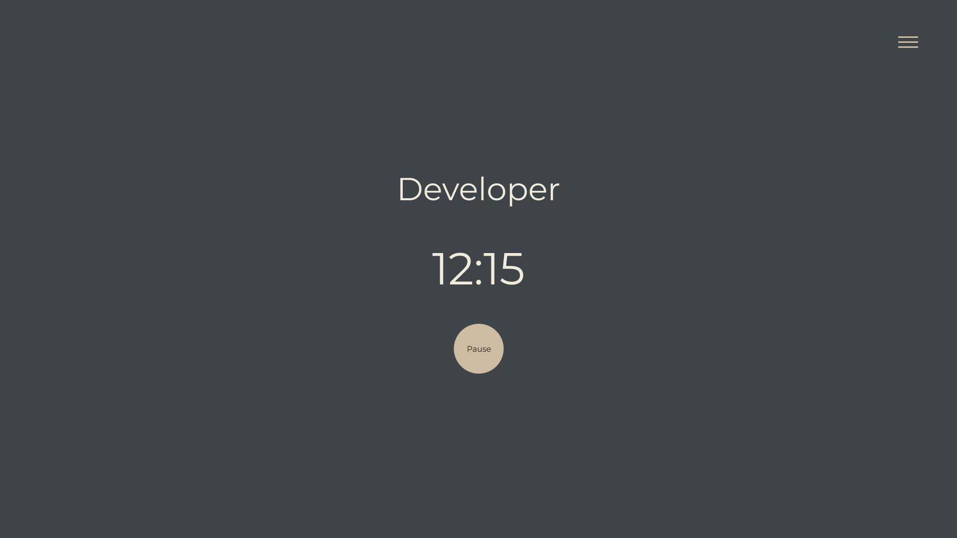
After completing the style sheet I started with a mobile-first approach, and changed a few things from the initial framing. One of those things was the clock; I liked the idea of an analog clock face that gave a sense of progress, but the more I thought about what would have to go into the design and functionality of it, I decided it would be simpler to use a digital display.
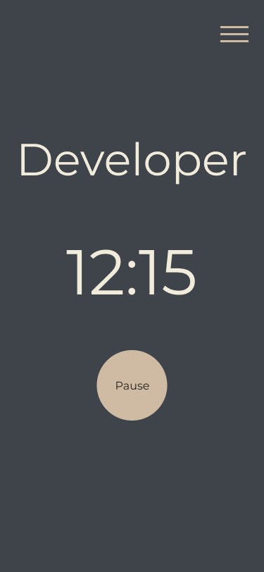
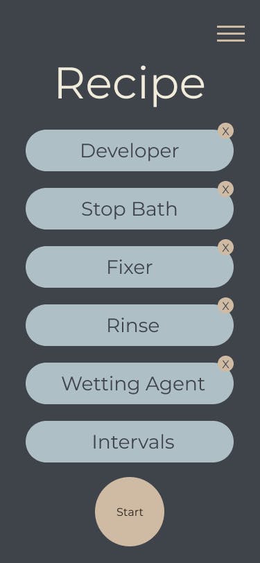
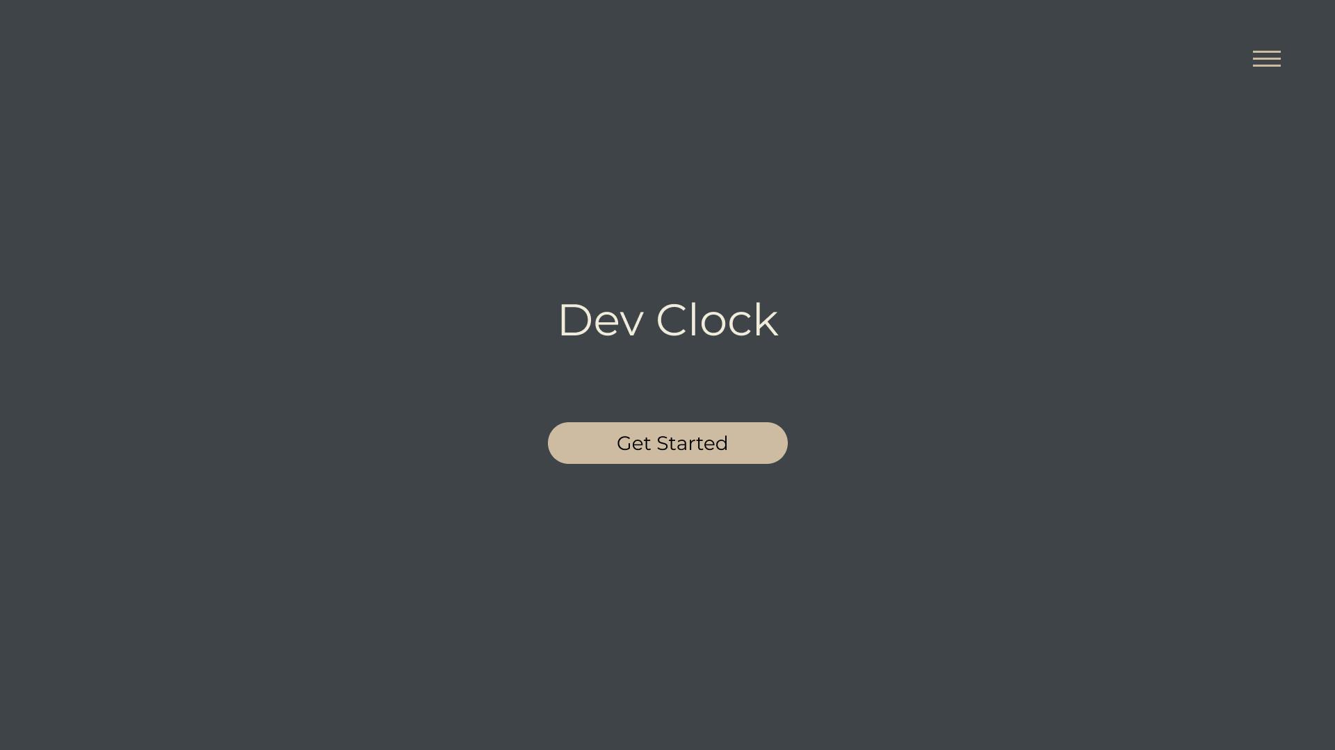
The rest of the design is pretty simple as well, but I'm sure it will expand after trial and error using the app itself. It can be difficult to have a good grasp on what the UX will be like and what is needed until it can be tested. One of the things I haven't quite settled on is the Recipe page where the user will input the different variables for the clock. There can be a lot of options the user could be entering and it gets a little crowded. Might be looking for alternative ways to accommodate the amount of info that needs to be entered. Other than that the rest of the layout is pretty straight forward!
Desktop View 🖥
One of the benefits of starting with a mobile-first approach is that it makes the desktop view almost too easy, especially for a simple app like this. Plus since Figma has a fantastic way of grouping components and applying auto layout to them, I just copied the main elements from the mobile view, pasted them to the desktop, adjusted the height, and I was done! Depending on how the UX goes during testing this might change a bit, but I was overall pretty pleased with out it turned out.
Tips and Tricks! 🛹
There's a lot you can do with Figma and there's plenty of good tutorials out there, but here are a few tips that can really accelerate your design game!
1. Learn Auto Layout!
This one little feature was a game changer for me! It's basically a design version of css flexbox and grid layout. It's incredibly helpful for when you want to space things out evenly, keep components organized, and visualize mobile to desktop layouts! I found these videos to be helpful with learning this awesome feature:
2. Take Advantage of Design Systems
I just bare scratched the surface of this concept with my style sheet, but this can get much more complicated when you have a larger project. Working with a design system can help scale your project and let you create reusable styles and components. Figma also let's you create variants where you can ever so slightly alter a component to meet your needs. It's a topic that will take some time to learn but it is worth while!
3. Design Mobile First!
I might be preaching to the choir here, but man this is important. For the longest time I heard that it was important to design mobile layouts first and then expand to desktop, but I always hated doing that. Desktop just gives you so much space and you can make it look incredible, and mobile can be just so much more restricting. But you know what's hilarious? More than likely when I visit a website I'm doing it on my phone, and then I get frustrated when the mobile version of the site sucks. Ironic isn't? I've tried to discipline myself with a mobile first approach and though its a bit more work up front with the UX/UI, it makes coding so much better!
Conclusion
With the design phase done it's on to coding! Stay tuned for future posts on the functionality of the web app and how we'll accomplish it with React.
Steve